Box Model
Every element in web design is a rectangular box.
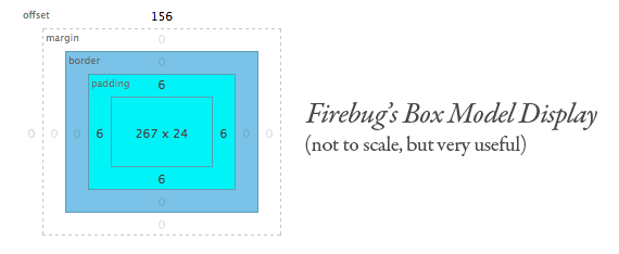
This is how the width and height is calculated in CSS -
- Width : width + padding-left + padding-right + border-left + border-right
- Height: height + padding-top + padding-bottom + border-top + border-bottom
The Default Width of Block Level Boxes
If you don't declare a width, and the box has static or relative positioning, the width will remain 100% in width and the padding and border will push inwards instead of outward. But if you explicitly set the width of the box to be 100%, the padding will push the box outward as normal.
In the following example we have a greyed box within it we have a paragraph. The 15px padding is pushed inward. Because we didn't explicitily provide the width of the container. So the padding and border will push inward. The reason is as the width is unspecified, the inner greyed box can take whatever width. It doesn't have to have a specific width. So browser do not care about it. Browser push the width and border width towards inside so that the greyed box stays fit perfectly within its container.
	<div class="box">
		<div style="background: grey; padding: 15px;">
			<p style="margin: 0; text-align: justify;">Lorem ipsum dolor sit amet, consectetur adipisicing elit, sed do eiusmod
			tempor incididunt ut labore et dolore magna aliqua. Ut enim ad minim veniam,
			quis nostrud exercitation ullamco laboris nisi ut aliquip ex ea commodo
			consequat. Duis aute irure dolor in reprehenderit in voluptate velit esse
			cillum dolore eu fugiat nulla pariatur. Excepteur sint occaecat cupidatat non
			proident, sunt in culpa qui officia deserunt mollit anim id est laborum.</p>
		</div>
	</div>
Lorem ipsum dolor sit amet, consectetur adipisicing elit, sed do eiusmod tempor incididunt ut labore et dolore magna aliqua. Ut enim ad minim veniam, quis nostrud exercitation ullamco laboris nisi ut aliquip ex ea commodo consequat. Duis aute irure dolor in reprehenderit in voluptate velit esse cillum dolore eu fugiat nulla pariatur. Excepteur sint occaecat cupidatat non proident, sunt in culpa qui officia deserunt mollit anim id est laborum.
Okay, this is pretty ovbious. Now lets set width to 100%. For this the browser must preserve 100% of the width for the greyed container. Now if we apply padding and border to the container, it must not decrease the width. So that's why browser push the border and width outward.
	<div class="box">
		<div style="background: grey; padding: 15px; width:100%;">
			<p style="margin: 0; text-align: justify;">Lorem ipsum dolor sit amet, consectetur adipisicing elit, sed do eiusmod
			tempor incididunt ut labore et dolore magna aliqua. Ut enim ad minim veniam,
			quis nostrud exercitation ullamco laboris nisi ut aliquip ex ea commodo
			consequat. Duis aute irure dolor in reprehenderit in voluptate velit esse
			cillum dolore eu fugiat nulla pariatur. Excepteur sint occaecat cupidatat non
			proident, sunt in culpa qui officia deserunt mollit anim id est laborum.</p>
		</div>
	</div>
Lorem ipsum dolor sit amet, consectetur adipisicing elit, sed do eiusmod tempor incididunt ut labore et dolore magna aliqua. Ut enim ad minim veniam, quis nostrud exercitation ullamco laboris nisi ut aliquip ex ea commodo consequat. Duis aute irure dolor in reprehenderit in voluptate velit esse cillum dolore eu fugiat nulla pariatur. Excepteur sint occaecat cupidatat non proident, sunt in culpa qui officia deserunt mollit anim id est laborum.
The lesson here being that the default width of a box isn't really 100% but a less tangible "whatever is left". This is particularly valuable to know, since there are lots of circumstances where it is immensely useful to either set or not set a width.
box-sizing
If an element has a specified width, any padding added to that element will add to the total width of the element. This is often an undesirable result, as it requires that an element's width be recalculated each time the padding is adjusted. (Note that this also happens with height, but in most cases it is preferred not to give an element a set height.)
	.box {
	    padding: 20px;
	    width: 400px;
	}

	<div class="box"></div>
In this example, although the .box element is given an explicit width of 400px, the actual rendered width of the element on the page will be 440px. This takes into account not only the 400px width, but also the 20px of left padding and the 20px of right padding (defined with padding shorthand in the previous example).
This happens in order to maintain 400px of content space, rather than 400px of total element width.
To resolve this issue, thus keeping the width at 400px no matter the amount of padding, you can use the box-sizing property:
	.box {
	 padding: 20px;
	 width: 400px;
	 box-sizing: border-box;
	}
	<div class="box"></div>
This causes the element to maintain its width while increasing the padding, thus decreasing the available content space
The original box model behavior was eventually considered unintuitive, so a new CSS property called box-sizing was created. When you set box-sizing: border-box; on an element, the padding and border of that element no longer increase its width.
Since box-sizing is pretty new, you should use the -webkit- and -moz- prefixes for now, as I have in these examples.
content-box
The default value for box-sizing is content-box, which is what we are overriding here. There is also a padding-box value but... kinda useless if you ask me. We'll get to what this means shortly.