display
The display property specifies if/how an element is displayed.
Every HTML element has a default display value depending on what type of element it is. The default display value for most elements is block or inline.
You can use the following value to the display property -
- inline
- inline-block
- block
- none
- flex
- table
- grid
inline

An inline element does not start on a new line and only takes up as much width as necessary.
An inline element will accept margin and padding, but the element still sits inline as you might expect. Margin and padding will only push other elements horizontally away, not vertically.
An inline element will not accept height and width. It will just ignore it.
<div class="box">
	<p>Lorem ipsum dolor sit amet, consectetur adipisicing elit, sed do eiusmod
	tempor incididunt ut labore et dolore magna aliqua. Ut enim ad minim veniam,
	quis nostrud exercitation <span style="padding: 30px; margin: 30px;">ullamco laboris nisi ut aliquip ex ea commodo
	consequat. Duis aute irure dolor</span> in reprehenderit in voluptate velit esse
	cillum dolore eu fugiat nulla pariatur. Excepteur sint occaecat cupidatat non
	proident, sunt in culpa qui officia deserunt mollit anim id est laborum.</p>
</div>
Lorem ipsum dolor sit amet, consectetur adipisicing elit, sed do eiusmod tempor incididunt ut labore et dolore magna aliqua. Ut enim ad minim veniam, quis nostrud exercitation ullamco laboris nisi ut aliquip ex ea commodo consequat. Duis aute irure dolor in reprehenderit in voluptate velit esse cillum dolore eu fugiat nulla pariatur. Excepteur sint occaecat cupidatat non proident, sunt in culpa qui officia deserunt mollit anim id est laborum.
As you can see, the margin of inline element is not effecting of the adjecent element vertically. It is only effecting horizontally.
In HTML, there are many inline element like - code, span, em, strong, b, i, u, var, label, a
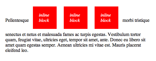
inline-block
An element set to inline-block is very similar to inline in that it will set inline with the natural flow of text (on the "baseline"). The difference is that you are able to set a width and height which will be respected.
Also, with display: inline-block, the top and bottom margins/paddings are respected, but with display: inline they are not.
Compared to display: block, the major difference is that display: inline-block does not add a line-break after the element, so the element can sit next to other elements.
.inlineBlockWithMarginAndPadding{
	display: inline-block;
	height: 50px;
	margin: 20px;
	padding: 20px;
	background: red;
}
.inlineBlockWithoutMarginAndPadding{
	display: inline-block;
	height: 50px;
	background: red;
}


<div class="box">
	<p style="background: #eee;">
		Lorem ipsum dolor sit amet, consectetur adipisicing elit, sed do eiusmod
		tempor incididunt ut labore et dolore magna aliqua. Ut enim ad minim veniam,
		quis nostrud exercitation ullamco laboris nisi ut aliquip ex ea commodo
		consequat. <span class="inlineBlockWithMarginAndPadding">Duis aute irure dolor</span> in reprehenderit in voluptate velit esse
		cillum dolore eu fugiat nulla pariatur. Excepteur sint occaecat cupidatat non
		proident, sunt in culpa qui officia deserunt mollit anim id est laborum.
	</p>
	<p style="background: #eee;">
		Lorem ipsum dolor sit amet, consectetur adipisicing elit, sed do eiusmod
		tempor incididunt ut labore et dolore magna aliqua. Ut enim ad minim veniam,
		quis nostrud exercitation ullamco laboris nisi ut aliquip ex ea commodo
		consequat. <span class="inlineBlockWithoutMarginAndPadding">Duis aute irure dolor</span> in reprehenderit in voluptate velit esse
		cillum dolore eu fugiat nulla pariatur. Excepteur sint occaecat cupidatat non
		proident, sunt in culpa qui officia deserunt mollit anim id est laborum.
	</p>
</div>
Lorem ipsum dolor sit amet, consectetur adipisicing elit, sed do eiusmod tempor incididunt ut labore et dolore magna aliqua. Ut enim ad minim veniam, quis nostrud exercitation ullamco laboris nisi ut aliquip ex ea commodo consequat. Duis aute irure dolor in reprehenderit in voluptate velit esse cillum dolore eu fugiat nulla pariatur. Excepteur sint occaecat cupidatat non proident, sunt in culpa qui officia deserunt mollit anim id est laborum.
Lorem ipsum dolor sit amet, consectetur adipisicing elit, sed do eiusmod tempor incididunt ut labore et dolore magna aliqua. Ut enim ad minim veniam, quis nostrud exercitation ullamco laboris nisi ut aliquip ex ea commodo consequat. Duis aute irure dolor in reprehenderit in voluptate velit esse cillum dolore eu fugiat nulla pariatur. Excepteur sint occaecat cupidatat non proident, sunt in culpa qui officia deserunt mollit anim id est laborum.
One common use for display: inline-block is to display list items horizontally instead of vertically
Unwanted White-Space
Consider the following Example -
.box{
  width: 25%;
  height: 50px;
  background-color: red;
  display: inline-block;
}

<table style='width: 100%;'>
  <tr>
    <td>
      <div class='box'></div>
      <div class='box'></div>
      <div class='box'></div>
      <div class='box'></div>
    </td>
  </tr>
</table>
Even though you have 25% width of each block and there is no margin around the each block, still there is a gap between these blocks. These are actually whitespace (line-break and spaces) after each div element. Here are some work around -
Specify the font-size to 0 to the parent container and override the font-size in children elements.
<style type="text/css">
.boxy2{
  width: 25%;
  height: 50px;
  background-color: red;
  display: inline-block;
  font-size: 13px;
}
</style>
<div class="box">
	<table style='width: 100%;'>
	  <tr>
	    <td style="font-size: 0;">
	      <div class='boxy2'></div>
	      <div class='boxy2'></div>
	      <div class='boxy2'></div>
	      <div class='boxy2'></div>
	    </td>
	  </tr>
	</table>
</div>
line-height | font-size
If you are overriding the display property to inline-block, don't forget to set line-height to 0 to the parent container and set the line-height to the each child elements.
You can also solve the propble using font-size property too.
Consider the following example -
.middle{
	border: 2px solid green;
	box-sizing: border-box;
}
.one{
	height: 50px;
	width: 50px;
	background: red;
	display: inline-block;
}
.two{
	height: 100px;
	width: 100px;
	background: yellow;
	display: inline-block;
}
.three{
	height: 50px;
	width: 50px;
	background: green;
	display: inline-block;
}

<div class="box">
	<div class="middle">
		<div class="one"></div>
		<div class="two"></div>
		<div class="three"></div>
	</div>
</div>
Notice there is a gap at the bottom of the div, even if there is no margin or padding. To deal with that issue, set the line-height to 0 and to parent container and set the line-height to the each child element.
<style type="text/css">
		.middle1{
        border: 2px solid green;
        box-sizing: border-box;
        line-height : 0;
    }
    .one1{
        height: 50px;
        width: 50px;
        background: red;
        display: inline-block;
        line-height: initial;
        vertical-align: bottom;
    }
    .two1{
        height: 100px;
        width: 100px;
        background: yellow;
        display: inline-block;
        line-height: initial;
        vertical-align: bottom;
    }
    .three1{
        height: 50px;
        width: 50px;
        background: green;
        display: inline-block;
        line-height: initial;
        vertical-align: bottom;
    }
</style>
<div class="box">
	<div class="middle1">
    <div class="one1">Box - 1</div>
    <div class="two1">Box - 2</div>
    <div class="three1">Box - 3</div>
  </div>
</div>
block
A number of elements are set to block by the browser UA stylesheet. They are usually container elements, like <div>, <section>, and <ul>. Also text "blocks" like <p> and <h1>. Block level elements do not sit inline but break past them. By default (without setting a width) they take up as much horizontal space as they can.
Hello CSS
Lorem ipsum dolor sit amet
As you can see, the text are small the element is taking the 100% width of the parent element. And each element starts on a new line.
none
If the display is set to none, the element will be dissapeared and will not be rendered in the iewport. But you can find the element if you inspect the DOM.
display: none; is commonly used with JavaScript to hide and show elements without deleting and recreating them.
table
There is a whole set of display values that force non-table elements to behave like table-elements, if you need that to happen. It's very rare, but it sometimes allows you to be "more semantic" with your code while utilizing the unique positioning powers of tables.
div {
  display: table;
  display: table-cell;
  display: table-column;
  display: table-colgroup;
  display: table-header-group;
  display: table-row-group;
  display: table-footer-group;
  display: table-row;
  display: table-caption;
}
To use, just mimic normal table structure. Simple example:
.tableRow{
	display: table-row;
}
.tableCell{
	border: 1px solid black;
	display: table-cell;
	padding: 5px;
}

<div style="display: table; border: 1px solid black;">
  <div class="tableRow">
    <div class="tableCell">Gross but sometimes useful.</div>
    <div class="tableCell">It is rarely used.</div>
  </div>
  <div class="tableRow">
    <div class="tableCell">Should be Avoided</div>
    <div class="tableCell">Use table element instead</div>
  </div>
</div>
Flex
display:flex; is already discussed in Flexbox Chapter in details.
Grid
display:grid; is already discussed in Grid Chapter in details.