Grid Terminology
Before diving into the concepts of Grid it's important to understand the terminology.
Grid Container
The element on which display: grid is applied. It's the direct parent of all the grid items. In the following example container is the grid container.
<div class="container">
	<div class="item item-1"></div>
	<div class="item item-2"></div>
	<div class="item item-3"></div>
</div>
Grid Item
The children (i.e. direct descendants) of the grid container. Here the item elements are grid items, but sub-item isn't.
<div class="container">
	<div class="item"></div>
	<div class="item">
		<p class="sub-item"></p>
	</div>
	<div class="item"></div>
</div>
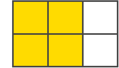
Grid Line
The dividing lines that make up the structure of the grid. They can be either vertical ("column grid lines") or horizontal ("row grid lines") and reside on either side of a row or column. Here the yellow line is an example of a column grid line.

Remember that there is also a grid line on the top of the first grid row and on the bottom of the last grid row. And also on the left edge of the first column and on the right edge of the last column.
Grid Track
The space between two adjacent grid lines. You can think of them like the columns or rows of the grid. Here's the grid track between the second and third row grid lines.

Grid Cell
The space between two adjacent row and two adjacent column grid lines. It's a single "unit" of the grid. Here's the grid cell between row grid lines 1 and 2, and column grid lines 2 and 3.

Grid Area
The total space surrounded by four grid lines. A grid area may be comprised of any number of grid cells. Here's the grid area between row grid lines 1 and 3, and column grid lines 1 and 3.
display:grid
An HTML element becomes a grid container by setting the display property to grid or inline-grid.
.grid-container {
	display: grid | inline-grid;
}
Now, all direct children of the grid container automatically become grid items. Here is an example -
div.grid-container-1{
	width : 500px;
	margin: auto;
	margin-top: 20px;
	background-color : pink;
	border: 1px solid black;

	display : grid;
}


<div class="grid-container-1">
	<div class="grid-item">1</div>
	<div class="grid-item">2</div>
	<div class="grid-item">3</div>
	<div class="grid-item">4</div>
	<div class="grid-item">5</div>
	<div class="grid-item">6</div>
</div>
grid-template-columns
This property is used to specify the number of columns that the grid will hold. Here is the syntax -
.grid-container{
	display : grid;
	grid-template-columns: 50px 100px auto;
}
In the example above we are specifying three column and amonth them the first column will be 50px width, second column will be 100px width and the last column will take the remaining space of the grid. Specifying the value auto will make the column auto adjustable. It means when you resize your grid the last column will accordingly be resized while the other fixed value column will remain with the same width which are defined on them. Here is an example -
div.grid-container-1{
  width : 500px;
  margin: auto;
  margin-top: 20px;
  background-color : pink;
  border: 1px solid black;

  display : grid;
  grid-template-columns : 50px 100px auto;
}
.grid-item{
	border: 1px solid black;
}
You can also make the second column auto, so that the last two column will take up equal width. You can give any width to any column according to your needs. Whatever combination you like.
If you don't specify the columns width, it will have the value auto.
.grid-container{
	grid-template-columns : 50px 100px;
}
grid-template-rows
Using this property you can define your row and their height. Just like the grid-template-columns this property has the same value format.
.grid-container{
	display : grid;
	grid-template-rows : 50px 150px;
}
In the above example, we are specifying that, the first row will have 50px height, and the second column will take 150px height. Here is a demo -
div.grid-container-3{
  width : 500px;
  margin: auto;
  margin-top: 20px;
  background-color : pink;
  border: 1px solid black;

  display : grid;
  grid-template-columns : 50px 100px auto;
  grid-template-rows: 50px 150px;
}
.grid-item-3{
  border: 1px solid black;
}


<div class="grid-container-3">
  <div class="grid-item-3">1</div>
  <div class="grid-item-3">2</div>
  <div class="grid-item-3">3</div>
  <div class="grid-item-3">4</div>
  <div class="grid-item-3">5</div>
  <div class="grid-item-3">6</div>
</div>
As you can see, the first row has 50px height and the second row has 150px height. If you set the height of the grid-container, you can see the remaining space are empty.
.grid-container-3{
	height : 300px;
}
You can make the last row take up the remaining space of the grid by setting the last value to auto of grid-template-rows property -
.grid-container-3{
	grid-template-rows: 50px auto;
}
By default, the row height is auto. It means if you don't specify the last row height on grid-template-rows property, it will have the value auto.
.grid-container-3{
	grid-template-rows: 50px;
}
repeat()
Repeat function repeats a value for multiple times. Suppose, your grid contains 10 column and you want to have the value 50px or auto for each column. You have to write 50px or auto for ten times. It is not efficient and also harder to manage later times. Repeat function simplyfy this and save us some keystroke. Here is the syntax -
.grid-container{
	grid-template-columns : repeat(10, 50px);
}
Here the first argument specifies how many times the function will repeat and the second argument specifies what to repeat. So in the above example, 50px will be repeated 10 times. The above example is equivalent to -
grid-teplate-columns : 50px 50px 50px 50px 50px 50px 50px 50px 50px 50px;
You can also use this function for grid-template-rows property.
The fr Unit
fr stands for fraction. It is the ratio you can specify. Let's say you have 500px grid container with three column. You want to give 100px to the middle column and the remaining space will be equally divided for first and last column. You can do it with fr unit like this -
.grid-container{
	grid-template-columns : 1fr 100px 1fr;
}
Well, you can also achieve the above problem using the value auto like this -
.grid-container{
	grid-template-columns : auto 100px auto;
}
So what's the benefit of using fr unit. Okay, what if you want to distribute the remaining space with 2:3 ratio? You can achieve this by fr unit like this -
.grid-container{
	grid-template-columns : 2fr 100px 3fr;
}
But it is impossible with auto value. If you think about solving the above problem using percentage value, it won't help. Because percentage value is calculated based on the grid width, not based on the remaining space.
Here is a demo -
div.grid-container-fr{
  width : 500px;
  margin: auto;
  margin-top: 20px;
  background-color : pink;
  border: 1px solid black;
  height: 300px;

  display : grid;
  grid-template-columns : 2fr 100px 1fr;
  grid-template-rows:50px;
}
.grid-item-fr{
  border: 1px solid black;
}


<div class="grid-container-fr">
  <div class="grid-item-fr">1</div>
  <div class="grid-item-fr">2</div>
  <div class="grid-item-fr">3</div>
  <div class="grid-item-fr">4</div>
  <div class="grid-item-fr">5</div>
  <div class="grid-item-fr">6</div>
</div>
Moving a Grid Item
By default grid items are structured how they appear on the HTML. Just like above example, all grid items are structured one after another the way they appear in the HTML code. But what if you want to move the third box to the place of 5th box? With the help of the following grid properties we will be able to do that -
- grid-column-start
- grid-column-end
- grid-row-start
- grid-row-end
Consider the following example. Here we have highlighted the third box with the red color and 5th box with the blue color.
div.grid-container{
  width : 500px;
  margin: auto;
  margin-top: 20px;
  background-color : pink;
  border: 1px solid black;
  height: 200px;

  display : grid;
  grid-template-columns : repeat(3, auto);
  grid-template-rows: auto auto;
}
.grid-item{
  border: 1px solid black;
}
.box-3{
  background-color : red;
  color: white;
}
.box-5{
  background-color: blue;
  color: white;
}

<div class="grid-container">
  <div class="grid-item box-1">1</div>
  <div class="grid-item box-2">2</div>
  <div class="grid-item box-3">3</div>
  <div class="grid-item box-4">4</div>
  <div class="grid-item box-5">5</div>
  <div class="grid-item box-6">6</div>
</div>
Now we will move the red box to the place of blue box. Here is the code -
.grid-item.box-3{
	grid-column-start: 2;
	grid-column-end: 3;
	grid-row-start: 2;
	grid-row-end: 3;
}
Here, grid-column-start takes the column line of the grid. Vertical grid lines are called column lines and horizontal grid lines are called row lines. The line starts from the edge of the grid container. So the first grid cell is between column line 1 and 2 and row line 1 and 2. The second grid cell is between column line 2 and 3 and row line 1 and 2, the third grid cell is between grid line 3 and 4 and row line 1 and 2 and so on.
So the above example tells that, the third box will start at the column line 2(grid-column-start) and end at the column line 3(grid-column-end) and start at row line 2(grid-row-start) and end at row line 3(grid-row-end).
Spanning of Grid Cell
Using the above properties you can make a cell span over multiple grid cell -
<style type="text/css">
div.grid-container-8{
  width : 500px;
  margin: auto;
  div.grid-container-7margin-top: 20px;
  background-color : pink;
  border: 1px solid black;
  height: 300px;

  display : grid;
  grid-template-columns : repeat(3, auto);
  grid-template-rows: repeat(3, 50px);
}
.grid-item-8{
  border: 1px solid black;
}
.grid-item-8.box-3{
  background-color : red;
  color: white;
  grid-column-start: 2;
  grid-column-end: 4;
  grid-row-start: 2;
  grid-row-end: 3;
}
.box-5{
  background-color: blue;
  color: white;
}
</style>
<div class="grid-container-8">
  <div class="grid-item-8 box-1">1</div>
  <div class="grid-item-8 box-2">2</div>
  <div class="grid-item-8 box-3">3</div>
  <div class="grid-item-8 box-4">4</div>
  <div class="grid-item-8 box-5">5</div>
  <div class="grid-item-8 box-6">6</div>
</div>
.grid-item-8.box-3{
  background-color : red;
  color: white;
  grid-column-start: 2;
  grid-column-end: 4;
  grid-row-start: 1;
  grid-row-end: 3;
}
grid-column
The property grid-column is a shorthand for grid-column-start and grid-column-end. Here is the syntax -
.grid-item{
	grid-column: start / end;
}
From the above example, we can rewrite the code using grid-column property -
.grid-item-9.box-3{
  background-color : red;
  color: white;
  grid-column: 2 / 4;
  grid-row-start: 1;
  grid-row-end: 3;
}
grid-row
The property grid-row is a shorthand for grid-row-start and grid-row-end. Here is the syntax -
.grid-item{
	grid-row: start / end;
}
From the above example, we can rewrite the code using grid-row property -
.grid-item-9.box-3{
  background-color : red;
  color: white;
  grid-column: 2 / 4;
  grid-row: 1 / 3;
}
grid-area
This property can be used to give a name to the grid item so that the name can be used as a reference to somewhere else. It can also be used as a shorthand property for grid-column and grid-row property.
The syntax for grid-area as shorthand is below -
grid-area : row-start / column-start / row-end / column-end;
Here is an example -
// Giving a grid item a name
.grid-item-9.box-3{
	grid-area: redBox;
}
.grid-item-9.box-5{
	grid-area: blueBox;
}


// Shorthand syntax -
.grid-item-9.box-3{
  background-color : red;
  color: white;
  grid-area : 1 / 2 / 3 / 4;
}
grid-column-gap
grid-column-gap is used to give a gap between to adjacent gap on the column.
div.grid-container-10{
  width : 500px;
  margin: auto;
  margin-top: 20px;
  background-color : pink;
  border: 1px solid black;
  height: 300px;

  display : grid;
  grid-template-columns : 2fr 100px 1fr;
  grid-template-rows:50px;
  grid-column-gap: 10px;
}
.grid-item-10{
  border: 1px solid black;
}
.box-3{
  background-color : red;
  grid-area : 1 / 2 / 3 / 4;
}
.box-5{
  background-color: blue;
}

<div class="grid-container-10">
  <div class="grid-item-10 box-1">1</div>
  <div class="grid-item-10 box-2">2</div>
  <div class="grid-item-10 box-3">3</div>
  <div class="grid-item-10 box-4">4</div>
  <div class="grid-item-10 box-5">5</div>
  <div class="grid-item-10 box-6">6</div>
</div>
grid-row-gap
grid-row-gap is used to give a gap between to adjacent gap on the row.
div.grid-container-11{
  width : 500px;
  margin: auto;
  margin-top: 20px;
  background-color : pink;
  border: 1px solid black;
  height: 300px;

  display : grid;
  grid-template-columns : 2fr 100px 1fr;
  grid-template-rows:50px;
  grid-row-gap: 10px;
}
.grid-item-11{
  border: 1px solid black;
}
.box-3{
  background-color : red;
  grid-area : 1 / 2 / 3 / 4;
}
.box-5{
  background-color: blue;
}

<div class="grid-container-11">
  <div class="grid-item-11 box-1">1</div>
  <div class="grid-item-11 box-2">2</div>
  <div class="grid-item-11 box-3">3</div>
  <div class="grid-item-11 box-4">4</div>
  <div class="grid-item-11 box-5">5</div>
  <div class="grid-item-11 box-6">6</div>
</div>
grid-gap
grid-gap is a shorthand syntax for grid-column-gap and grid-row-gap. Here is the syntax -
grid-gap: rowGap columnGap;
.grid-container{
	grid-gap: 10px 10px;
}
If you specify one value, it will be same for both grid-column-gap and grid-row-gap.
div.grid-container-11{
  width : 500px;
  margin: auto;
  margin-top: 20px;
  background-color : pink;
  border: 1px solid black;
  height: 300px;

  display : grid;
  grid-template-columns : 2fr 100px 1fr;
  grid-template-rows:50px;
  grid-gap: 10px;
}
.grid-item-11{
  border: 1px solid black;
}
.box-3{
  background-color : red;
  grid-area : 1 / 2 / 3 / 4;
}
.box-5{
  background-color: blue;
}

<div class="grid-container-11">
  <div class="grid-item-11 box-1">1</div>
  <div class="grid-item-11 box-2">2</div>
  <div class="grid-item-11 box-3">3</div>
  <div class="grid-item-11 box-4">4</div>
  <div class="grid-item-11 box-5">5</div>
  <div class="grid-item-11 box-6">6</div>
</div>
justify-content
This property specifies how the content should be aligned horizontally. The grid's total width has to be less than the container's width for the justify-content property to have any effect. Consider the following example -
div.grid-container-3{
  width : 500px;
  margin: auto;
  margin-top: 20px;
  background-color : pink;
  border: 1px solid black;
  height: 300px;

  display : grid;
  grid-template-columns : 50px 50px 50px;
  grid-template-rows:50px 50px;
  grid-column-gap: 10px
}
.grid-item-3{
  border: 1px solid black;
}


<div class="grid-container-3">
  <div class="grid-item-3 box-1">1</div>
  <div class="grid-item-3 box-2">2</div>
  <div class="grid-item-3 box-3">3</div>
  <div class="grid-item-3 box-4">4</div>
  <div class="grid-item-3 box-5">5</div>
  <div class="grid-item-3 box-6">6</div>
</div>
.grid-container{
	justify-content: center;
}
.grid-container{
	justify-content: start;
}
.grid-container{
	justify-content: end;
}
.grid-container{
	justify-content: stretch;
}
The value stretch resizes the grid items to allow the grid to fill the full width of the grid container.
.grid-container{
	justify-content: space-evenly;
}
.grid-container{
	justify-content: space-around;
}
.grid-container{
	justify-content: space-between;
}
align-content
Sometimes the total size of your grid might be less than the size of its grid container. This could happen if all of your grid items are sized with non-flexible units like px. In this case you can set the alignment of the grid within the grid container. This property aligns the grid along the block (column) axis (as opposed to justify-content which aligns the grid along the inline (row) axis).
.grid-container{
	justify-content: start;
}
.grid-container{
	justify-content: center;
}
.grid-container{
	justify-content: end;
}
.grid-container{
	justify-content: stretch;
}
.grid-container{
	justify-content: space-evenly;
}
.grid-container{
	justify-content: space-around;
}
.grid-container{
	justify-content: space-between;
}
justify-items
The property justify-items is used to align content of the grid cell horizontally. Consider the following example -
div.grid-container-3{
  width : 500px;
  margin: auto;
  margin-top: 20px;
  background-color : pink;
  border: 1px solid black;
  height: 300px;

  display : grid;
  grid-template-columns : auto auto auto;
  grid-template-rows:auto auto;
  grid-gap: 10px;
}
.grid-item-3{
  border: 1px solid black;
}

<div class="grid-container-3">
  <div class="grid-item-3 box-1">1</div>
  <div class="grid-item-3 box-2">2</div>
  <div class="grid-item-3 box-3">3</div>
  <div class="grid-item-3 box-4">4</div>
  <div class="grid-item-3 box-5">5</div>
  <div class="grid-item-3 box-6">6</div>
</div>
.grid-item-14{
	justify-items : start;
}
.grid-item-14{
	justify-items : end;
}
.grid-item-14{
	justify-items : stretch;
}
.grid-item-14{
	justify-items : center;
}
align-items
The property align-items is used to align content of the grid cell vertically. Consider the following example -
.grid-item-14{
	align-items : start;
}
.grid-item-14{
	align-items : end;
}
.grid-item-14{
	align-items : stretch;
}
.grid-item-14{
	align-items : center;
}
place-items
The property place-items is shorthand for justify-items and align-items. Here is the syntax -
.grid-container{
	place-items: align-items / justify-items;
}
For example -
.grid-container{
	place-items: center / space-around;
}
This property is not well supported in most browsers. Should avoid using this property.
place-content
The property place-content is used as a shorthand of justify-content and align-content property. Here is the syntax -
.grid-container{
	place-content: align-items / justify-items;
}
For example -
.grid-container{
	place-content: center / space-around;
}
This property is not well supported in most browsers. Should avoid using this property.
grid-template-areas
Defines a grid template by referencing the names of the grid areas which are specified with the grid-area property. Repeating the name of a grid area causes the content to span those cells. A period signifies an empty cell. The syntax itself provides a visualization of the structure of the grid.
.container {
  grid-template-areas:
    "<grid-area-name> | . | none | ..."
    "...";
}
Consider the following example -
<div class="grid-container">
  <div class="header">Header</div>
  <div class="main">Main</div>
  <div class="leftSidebar">Left Sidebar</div>
  <div class="rightSidebar">Right Sidebar</div>
  <div class="footer">Footer</div>
</div>

div.grid-container{
  width : 500px;
  margin: auto;
  margin-top: 20px;
  background-color : pink;
  border: 1px solid black;
  height: 300px;


  display : grid;
  grid-template-columns: 100px auto 100px;
}
.grid-container>div{
  border: 1px solid black;
  display:flex;
  justify-content:center;
  align-items:center;
}
.header{
  grid-area: header;
  background: blue;
  color: #fff;
}
.main{
  grid-area: main;
  background: green;
  color: #fff;
}
.leftSidebar{
  grid-area: leftSidebar;
  background: crimson;
  color: #fff;
}
.rightSidebar{
  grid-area: rightSidebar;
  background: crimson;
  color: #fff;
}
.demoFooter{
  grid-area: footer;
  background : black;
  color: #fff;
}
Initially, it overlaps with each other. It will look like the above. Now we will use grid-template-areas to define the layout of the grid. In the above example we have given each grid item their name using grid-area property.
.grid-container{
	grid-template-areas :
			"header header header"
			"leftSidebar main rightSidebar"
			"footer footer footer";
}
As you can see how we defined our grid layout using grid-template-areas. It consists of some string seperated with a space. Each string represents an individual row. Each row consists of one or more grid name which are specified by grid-area.
Each name in the string represents a column. In the first string, we have header three times. It means the header will space over three columns. In the second string, we have leftSidebar, main and rightSidebar. And in the last string, we have footer three times.
There are one rule to remember- The number of grid name that appears on each string must be same in all string. For example if one string or row contains three names, then each string must contain three names. Each name represents a column. We have three columns mentioned on each row. Any mismatch on the number of name within the string would cause problem and the layout will break.
Now let's play around with the layout. What if you want your left sidebar to be below of the header and goes all the way down the footer so that the footer will be by the side of the leftSidebar. Consider the following example -
.grid-container{
	grid-template-areas :
			"header header header"
			"leftSidebar main rightSidebar"
			"leftSidebar footer footer";
}
You can do the same thing for the right sidebar too -
.grid-container{
	grid-template-areas :
			"header header header"
			"leftSidebar main rightSidebar"
			"leftSidebar footer rightSidebar";
}
You can also give the entire left side for the left sidebar -
.grid-container{
	grid-template-areas :
			"leftSidebar header header"
			"leftSidebar main rightSidebar"
			"leftSidebar footer rightSidebar";
}
Your layout will work as long as the structure logically make sense. For example, consider the following -
.grid-container{
	grid-template-areas :
			"leftSidebar header footer"
			"leftSidebar main rightSidebar"
			"leftSidebar footer rightSidebar";
}
Things is not working for the above layout. Because on the first row we have mentioned footer, logically it doesn't make a sense how the structure should be. Always remember that the grid item should not be seperated and geomatrically it always should be rectangle. Now you can have any layout as long as this rule doesn't break.
grid-template
A shorthand for setting grid-template-rows, grid-template-columns, and grid-template-areas in a single declaration. Here is the syntax -
.container {
  grid-template: none | <grid-template-rows> / <grid-template-columns>;
}
If you use the value none, it sets all three properties to their initial values. If you use the second value, it sets the grid-template-rows and grid-template-columns respectively but it sets grid-template-ares to none.
Another syntax of this property is to specify all three values at once -
.container {
  grid-template:
    [row1-start] "header header header" 25px [row1-end]
    [row2-start] "footer footer footer" 25px [row2-end]
    / auto 50px auto;
}
The above is equivalent to -
.container {
  grid-template-rows: [row1-start] 25px [row1-end row2-start] 25px [row2-end];
  grid-template-columns: auto 50px auto;
  grid-template-areas:
    "header header header"
    "footer footer footer";
}
Even though using this property will save you some keystroke, but it looses the readibility. That's why explicit declaration using all three properties are prefferable.
span Keyword
So far we have been using numeric number for the property grid-column-end and grid-row-end. You can also specify span keyword followed by a numeric number. For example consider the following example -
<div class="grid-container-15">
  <div class="grid-item-15">1</div>
  <div class="grid-item-15">2</div>
  <div class="grid-item-15">3</div>
  <div class="grid-item-15">4</div>
  <div class="grid-item-15">5</div>
</div>

div.grid-container-15{
  width : 500px;
  margin: auto;
  margin-top: 20px;
  background-color : pink;
  border: 1px solid black;
  height: 300px;

  display : grid;
  grid-template-columns: repeat(3, 1fr);
  grid-template-rows: repeat(2, 1fr);
  grid-gap: 10px;
  padding: 10px;
}
.grid-container-15>div{
  border: 1px solid black;
}
.grid-container-15>div:nth-child(2){
  grid-column: 2 / 4;
  background-color : red;
}
In the above example we are dealing with numeric number for the grid-column property. In the above example, we are saying that the second grid item will start at grid line 2 and end at grid line 4. It means it will span over two grid column. You can specify how much grid column the grid item will span over using the keyword span followed by a numeric number which specifies the number of column that the grid item will span over.
grid-column: 2 / span 2;
You will get the same output.
.grid-container-15>div:nth-child(2){
  grid-column: 2 / span 2;
  background-color : red;
}
The same rule goes for the grid-row property. Consider the following example -
.grid-container-15>div:nth-child(2){
  grid-column: 2 / span 2;
  grid-row: 1 / span 2;
  background-color : red;
}
The keyword span is invalid for grid-column-start and grid-row-start.
You can explicitily specify the span keyword on the grid-column-end and grid-row-end property.
.grid-container-15>div:nth-child(2){
  grid-column-start: 2;
  grid-column-end: span 2;
  grid-row-start: 1;
  grid-row-end: span 2;
  background-color : red;
}
auto-fill keyword
The keyword auto-fill is used as the first argument of repeat() function which tells the browser to automatically create as many grid columns as possible. The second argument specifies the each grid column width.
Consider the following example -
div.grid-container-16{
  width : 500px;
  margin: auto;
  margin-top: 20px;
  background-color : pink;
  border: 1px solid black;

  display : grid;
  grid-template-columns: repeat(auto-fill, 1fr);
  grid-gap: 10px;
  padding: 10px;
}
.grid-container-16>div{
  border: 1px solid black;
  padding: 20px
}

<div class="grid-container-16">
  <div class="grid-item-16">1</div>
  <div class="grid-item-16">2</div>
  <div class="grid-item-16">3</div>
  <div class="grid-item-16">4</div>
  <div class="grid-item-16">5</div>
  <div class="grid-item-16">6</div>
</div>
As you can see in the above example, we are using auto-fill. It means we are telling browser to create as many columns as possible and each one have the 1fr width. Since 1fr means the whole with, so only one column is created. Now consider the following example -
.grid-container-16{
	grid-template-columns: repeat(auto-fill, 100px);
}
In the above example, we are specifying 100px for each grid item. So only four can be created with the grid-gap.
You can achieve the same thing using the following code -
grid-template-columns: repeat(4, 100px);
So what's the benefit of using auto-fill? Well, if you use fixed value for the number of columns, and then if you resize your grid, the grid-items will overflow and will be hidden. But with the auto-fill keyword, if you resize your grid container, the grid column will also auto adjust. If you shrink your grid container enough, the trailer grid item will span over next line. You can experiment in the browser console.
If you notice, after creating four columns there are some gap at the end of the last column. In the next section with the help of minmax() we will see how to fill that gap.
minmax()
minmax() function is used with repeat() function and is used to specify the minimum width and the maximum width of the grid column. Consider the following example -
grid-template-columns: repeat(auto-fill, minmax(100px, 1fr));
The function minmax takes the minimum width as the first argument and maximum width as the second argument. The browser first creates grid columns with the min-width to see how much grid column can be created, then the browser uses the second argument to distribute the remaining space to each grid item. Here, you can use any absolute value (like px) for the maximum width instead of using 1fr. But there is no guarantte that after reaching maximum width of the grid item, there won't be any remaining space. Here is an example -
As you notice in the above example, there are still some space left over. So it is always better to use 1fr as the maximum width.
The function minmax() can also be used with fixed numbered columns. For example -
grid-template-columns: repeat(4, minmax(100px, 1fr));
In the above example, we are telling browser to create grid columns with the minimum width 100px, and if there are some space available use the maximum width to stretch all the grid items equally untill the grid container fills with the grid item.
In the above examples, the outputs are same for fixed numbered column and auto-fill keyword. Well, one thing to note that, if you use fixed number for the column, the grid will always have fixed number of column regerdless if you resize your grid container. But for the keyword auto-fill, the grid columns are dynamic. If you resize your grid container, your grid columns will change accordingly and causing the trailling grid-item to span over next grid row.
So with the combination of auto-fill and min-max you can have more flexibility.
auto-fit Keyword
Just like auto-fill, you can also use auto-fit keyword as the first argument. auto-fit is just like auto-fill with a major difference. Consider the following example -
div.grid-container-21{
  width : 700px;
  margin: auto;
  margin-top: 20px;
  background-color : pink;
  border: 1px solid black;

  display : grid;
  grid-template-columns: repeat(auto-fill, minmax(70px, 1fr));
  grid-gap: 10px;
  padding: 10px;
}
.grid-container-21>div{
  border: 1px solid black;
  padding: 20px
}

<div class="grid-container-21">
  <div class="grid-item-21">1</div>
  <div class="grid-item-21">2</div>
  <div class="grid-item-21">3</div>
  <div class="grid-item-21">4</div>
  <div class="grid-item-21">5</div>
  <div class="grid-item-21">6</div>
</div>
In the example above, there are 6 grid items. But the number of grid column created is 8. So there are 8 grid columns above. As there are only 6 grid items, two grid columns remains empty. That's why even though you are using 1fr as the maximum width, the grid items are not filling the grid container as there are still two columns acting as a placeholder. Now consider the same example with the auto-fit keyword.
grid-template-columns: repeat(auto-fit, minmax(70px, 1fr));
You can see visually that the grid items are stretched to fill the grid container. You might think that with the keyword auto-fit, only six columns are created. But no. It creates the same number of grid column as auto-fill would. But the difference is that the empty grid columns are not acting as a placeholder anymore. Instead they are squeezed in on a single line with the width of nothing. In other words they are not displayed on the grid container. That's why the six columns are stretched out to fill out the available gap.
grid-auto-columns
Suppose you have 3/3 grid, on which you want to move a grid out of the grid container. Consider the following example -
<div class="grid-container">
  <div class="grid-item">1</div>
  <div class="grid-item">2</div>
  <div class="grid-item">3</div>
  <div class="grid-item">4</div>
  <div class="grid-item">5</div>
  <div class="grid-item">6</div>
  <div class="grid-item">7</div>
  <div class="grid-item">8</div>
  <div class="grid-item">9</div>
</div>


div.grid-container{
  margin: auto;
  margin-top: 20px;
  background-color : pink;
  border: 1px solid black;

  display : grid;
  grid-template-columns: repeat(3, 100px);
  grid-gap: 10px;
  padding: 10px;
}
.grid-container>div{
  border: 1px solid black;
}
Now you want to move grid item 4 to the grid column 5, which doesn't exists -
grid-container>div:nth-child(4){
	grid-column : 5 / 6;
	grid-row : 2 / 3;
}
As you can see, initially we had three columns and each column had width of 100px. But when we moved 4th box to the 5th column which doesn't exists, the browser creates extra grid column automatically. And those extra grid columns fill out the whole grid-container as they have the auto value by default. As those columns are created automatically they are called auto-columns. You can control their width by using grid-auto-columns property.
.grid-container{
	grid-auto-columns: 50px;
}
You can also use minmax to specify the minimum width and maximum width of the auto generated column.
grid-auto-rows
Consider the above example where we want to move the 4th grid item to the 5th grid row which doesn't exists -
<style type="text/css">
div.grid-container-25{
  margin: auto;
  margin-top: 20px;
  background-color : pink;
  border: 1px solid black;

  display : grid;
  grid-template-columns: repeat(3, 100px);
  grid-template-rows: repeat(3, 100px);
  grid-gap: 10px;
  padding: 10px;
}
.grid-container-25>div{
  border: 1px solid black;
}
.grid-container-25>div:nth-child(4){
	grid-column: 1 / 2;
	grid-row : 5 / 6;
}
</style>
<div class="grid-container-25">
  <div class="grid-item-25">1</div>
  <div class="grid-item-25">2</div>
  <div class="grid-item-25">3</div>
  <div class="grid-item-25">4</div>
  <div class="grid-item-25">5</div>
  <div class="grid-item-25">6</div>
  <div class="grid-item-25">7</div>
  <div class="grid-item-25">8</div>
  <div class="grid-item-25">9</div>
</div>
Notice in the above example, the broswer creates extra grid rows to accomodate the 4th grid item. They have the default value auto, it means they will take up as much space as possible to fill out the available grid container height. As we don't have specified height for the grid-container, they are taking minimum height. If you explicitily want to control the height of the extra automatically generated rows, you can do it with grid-auto-rows property.
.grid-container{
	grid-auto-rows: 50px;
}
You can also use minmax to specify the minimum height and maximum height of the auto generated row.
justify-self
The property justify-items for grid container applies to all grid items. What if you want to specify different horizontal position for a particular grid items? The property justify-self for the grid item solves this problem. Here is an example -
<div class="grid-container">
  <div class="grid-item">1</div>
  <div class="grid-item">2</div>
  <div class="grid-item">3</div>
  <div class="grid-item">4</div>
  <div class="grid-item">5</div>
  <div class="grid-item">6</div>
  <div class="grid-item">7</div>
  <div class="grid-item">8</div>
  <div class="grid-item">9</div>
</div>


div.grid-container{
  width : 700px;
  margin: auto;
  margin-top: 20px;
  background-color : pink;
  border: 1px solid black;
  height: 500px;

  display : grid;
  grid-template-columns: repeat(3, 100px);
  grid-template-rows: repeat(3, 70px);
  grid-gap: 10px;
  padding: 10px;
  justify-content: center;
}
.grid-container>div{
  border: 1px solid black;
  padding: 20px
}
.grid-container>div:nth-child(5){
  justify-self: end;
}
align-self
The property align-items for grid container applies to all grid items. What if you want to specify different vertical position for a particular grid items? The property align-self for the grid item solves this problem. Here is an example -
place-self
place-self sets both the align-self and justify-self properties in a single declaration.
.grid-item{
	place-self: align-self justify-self;
}
For example -
.grid-item{
	place-self : center center;
}