InputDecoration
The widget TextField is not a native flutter widget. But rather a Material Widget that implements EditableText widget. The TextField Widget gives you material look and feel. You can customize the widget in various way. To customize the TextField widget you need to use InputDecoration class. In this secton we will explore various way to customize the TextField widget.
Customizing Border
You can customize the border in various way. Different border can be set for different state of the TextField. For example, when there is an error you can specify a differnt border style, or when there is a focus on the TextField you can also set different styled border. Here are the properties you can use for customizing the border.
border
The shape of the border to draw around the decoration's container.
disabledBorder
The border to display when the InputDecorator is disabled and is not showing an error.
enabledBorder
The border to display when the InputDecorator is enabled and is not showing an error.
errorBorder
The border to display when the InputDecorator does not have the focus and is showing an error.
focusedBorder
The border to display when the InputDecorator has the focus and is not showing an error.
focusedErrorBorder
The border to display when the InputDecorator has the focus and is showing an error.
Customizing Label
Label is shown at the middle of the TextField vertically and on the left side horizontally. A label also overlaps suffix, suffixIcon and suffixText(suffix area). When you tap on the TextField the label shrinks in size and floats above the editable area and makes the suffix area visible. You can made the label always float so that the suffix area can be visible by default. Here are the options through which you can customize the label.
labelText
Text that describes the input field. The label can be made to float when user taps on the TextField. Unlike hint the label doesn't dissapear.
labelStyle
To style the label use labelStyle property. Use TextStyle to provide the style.
floatingLabelBehavior
Defines how the floating label should be displayed.
When FloatingLabelBehavior.auto the label will float to the top only when the field is focused or has some text content, otherwise it will appear in the field in place of the content. This is default.
When FloatingLabelBehavior.always the label will always float at the top of the field above the content.
When FloatingLabelBehavior.never the label will always appear in an empty field in place of the content.
Customizing Hint Text
Hint text appears right on the editable text area. When you tap on the TextField the label floats above and it makes the hint text Visible. Hint text appears after the suffix area. The HintText is visible only when there is no text in the TextField. When you start typing the hint text dissapears. It works like a placeholder in HTML input. To customize the hint text you can use following properties:
hintStyle
The style to use for the hintText.
hintText
Text that suggests what sort of input the field accepts.
hintMaxLines
The maximum number of lines the hintText can occupy.
Customizing Error Text
Error text appears below the text input. You can use this field to show some validation error and any kind of other information. To customize the error text use the following propertes:
errorText
Text that appears below the input child and the border.
errorStyle
The style to use for the errorText.
errorMaxLines
The maximum number of lines the errorText can occupy.
Customizing Helper Text
Helper text appears below the TextField, where the error text is shown. You can set helper text to provide additional information about the input. You can use following properties to customize the helper text:
helperText
Text that provides context about the input child's value, such as how the value will be used. If non-null, the text is displayed below the input child, in the same location as errorText. If a non-null errorText value is specified then the helper text is not shown.
helperStyle
The style to use for the helperText.
helperMaxLines
The maximum number of lines the helperText can occupy.
Configuring Padding
To set padding use contentPadding property.
contentPadding
The padding for the input decoration's container.
contentPadding: EdgeInsets.fromLTRB(12, 12, 12, 12),
Setting Icon
To set an icon for the input field, use icon property.
icon
An icon to show before the input field and outside of the decoration's container. A collapsed decoration cannot have labelText, errorText, an icon.
Customizing Background Color
If you want to have a background color, you must set filled property to true, and then set the color using fillColor property.
fillColor
The base fill color of the decoration's container color. That means the background color of the TextField.
filled
If true the decoration's container is filled with fillColor.
Customizing Preffix
You can provide a preffix icon that appears at the very first place of the input line. After the preffix icon, you can place a custom widget known as preffix widget and then you can insert a preffix text. Use the following properties to customize preffix.
prefixIcon
An icon that appears before the prefix or prefixText and before the editable part of the text field, within the decoration's container.
prefixIconConstraints
The constraints for the prefix icon. You can provide a BoxConstraints for the prefixIcon through this property.
prefix
Optional widget to place on the line before the input.
prefixText
Optional text prefix to place on the line before the input.
prefixStyle
The style to use for the prefixText.
Customizing Suffix
In suffix area, the custom widget comes first, then the suffix text is placed and then at the end the suffix icon is placed. Use the following properties to cusstomize the suffix.
suffix
Optional widget to place on the line after the input.
suffixText
Optional text suffix to place on the line after the input.
suffixStyle
The style to use for the suffixText.
suffixIcon
An icon that appears after the editable part of the text field and after the suffix or suffixText, within the decoration's container.
suffixIconConstraints
The constraints for the suffix icon. You can provide a BoxConstraints for the suffixIcon through this property.
Customizing Counter Text
Counter text appears below the text field and on the right side. To customize counter use the following properties:
counter
Optional custom counter widget to go in the place otherwise occupied by counterText. If this property is non null, then counterText is ignored.
counterText
Optional text to place below the line as a character count.
counterStyle
The style to use for the counterText.
Disable the TextField
When the TextField is disabled, you should also set enabled property of InputDecoration to false to maintain the visual display. When the enabled property is set to false, the helperText, errorText and counterText are not displayed.
enabled
If false, helperText, errorText, and counterText are not displayed, and the opacity of the remaining visual elements is reduced.
Examples
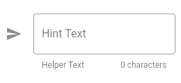
Example 1
Widget build(BuildContext context) {
  return TextField(
    decoration: InputDecoration(
      icon: Icon(Icons.send),
      hintText: 'Hint Text',
      helperText: 'Helper Text',
      counterText: '0 characters',
      border: const OutlineInputBorder(),
    ),
  );
}
The above code will produce the following output:
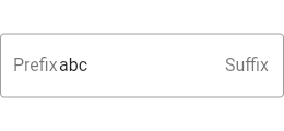
Example 2
Widget build(BuildContext context) {
  return TextFormField(
    initialValue: 'abc',
    decoration: const InputDecoration(
      prefix: Text('Prefix'),
      suffix: Text('Suffix'),
      border: OutlineInputBorder(),
    ),
  );
}
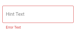
Example 3
Widget build(BuildContext context) {
  return TextField(
    decoration: InputDecoration(
      hintText: 'Hint Text',
      errorText: 'Error Text',
      border: OutlineInputBorder(),
    ),
  );
}