BoxFit
How a box should be inscribed into another box. This class defines the following constants:
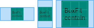
contain
As large as possible while still containing the source entirely within the target box.
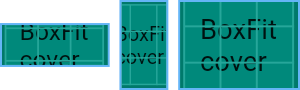
cover
As small as possible while still covering the entire target box.
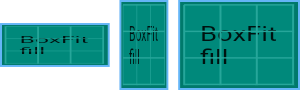
fill
Fill the target box by distorting the source's aspect ratio.
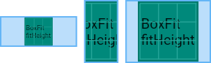
fitHeight
Make sure the full height of the source is shown, regardless of whether this means the source overflows the target box horizontally.
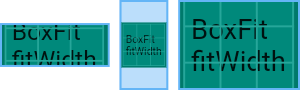
fitWidth
Make sure the full width of the source is shown, regardless of whether this means the source overflows the target box vertically.
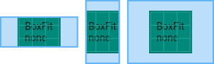
none
Align the source within the target box (by default, centering) and discard any portions of the source that lie outside the box. The source image is not resized.
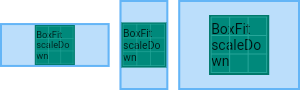
scaleDown
Align the source within the target box (by default, centering) and, if necessary, scale the source down to ensure that the source fits within the box.
This is the same as contain if that would shrink the image, otherwise it is the same as none.
FittedBox Widget
Scales and positions its child within itself according to fit. If a child is unable to fit inside the parent for example the child is bigger than the parent widget, then you can use FittedBox to scale the child widget to fit in the parent. Or If the child widget is small but you want your child widget to take the whole are of the parent you can use FittedBox. Note that this widget will scale its child means it is like zooming in or zooming out or stretching the child. So the content might get smaller or bigger.
container(
	width : 100,
	height : 100,
	child : FittedBox(
		fit : BoxFit.contain,
		alignment : Alignment.center,
		child : Container(
			width : 150,
			height : 150,
			child : Text("Hi..."),
		)
	)
)
The fit argument is used to specify the BoxFit value to tell the widget how the child should be fitted within the parent.
The alignment property aligns the child within itself accroding to the Alignment value.